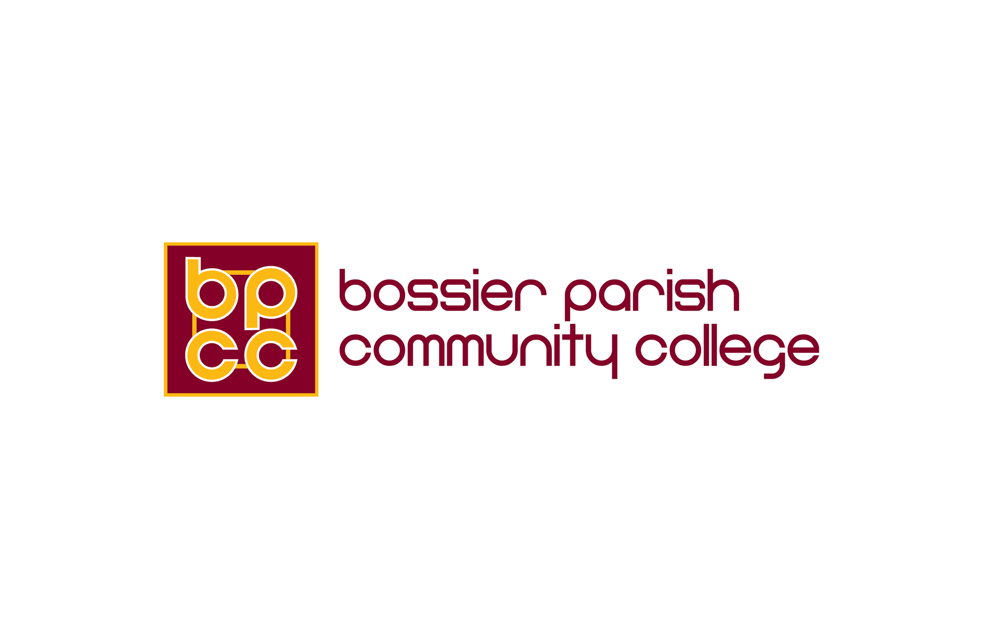
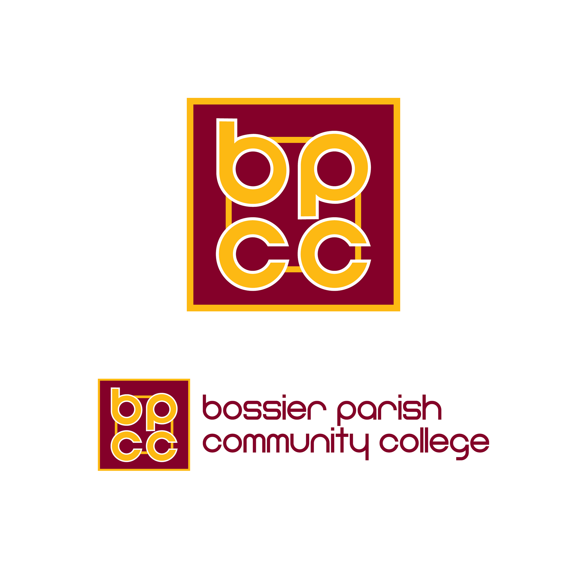
existing logo
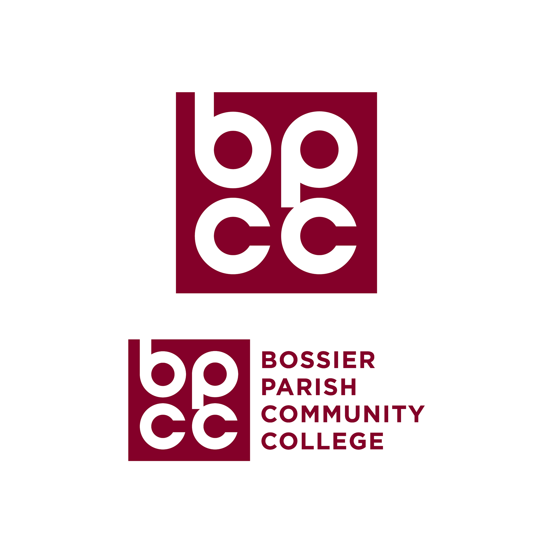
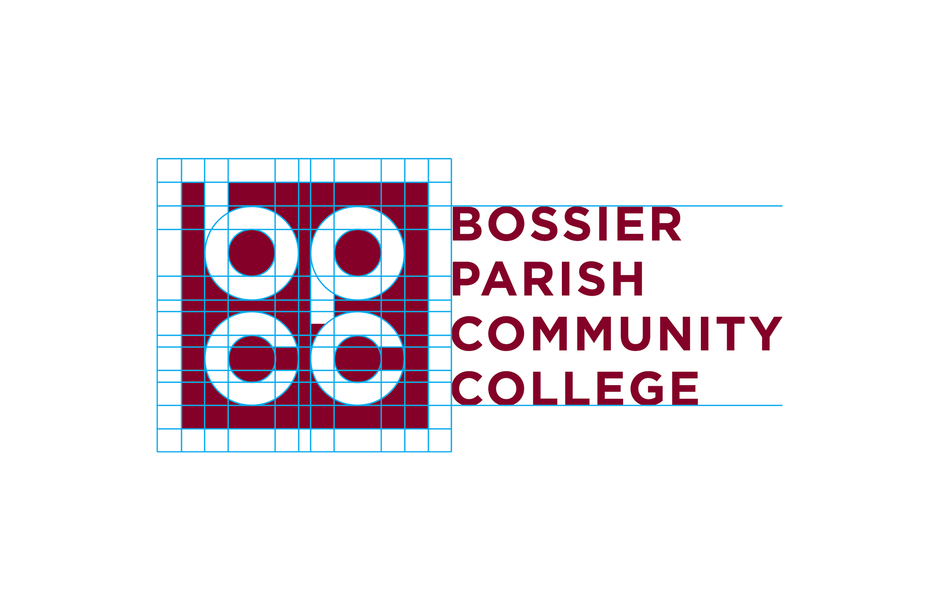
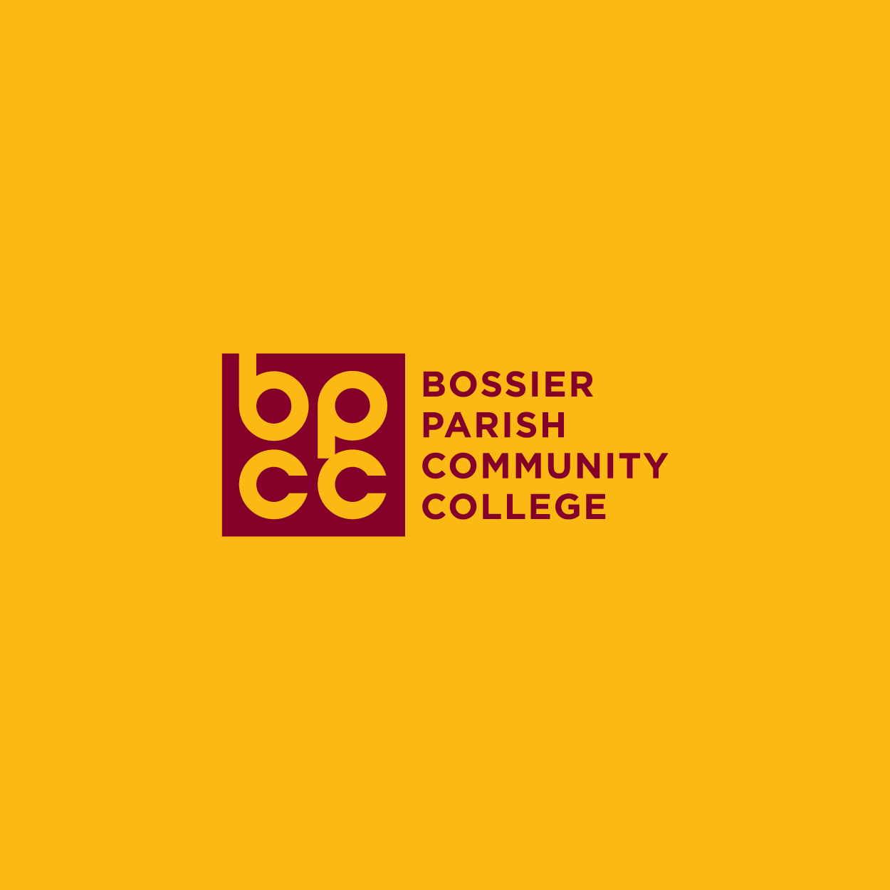
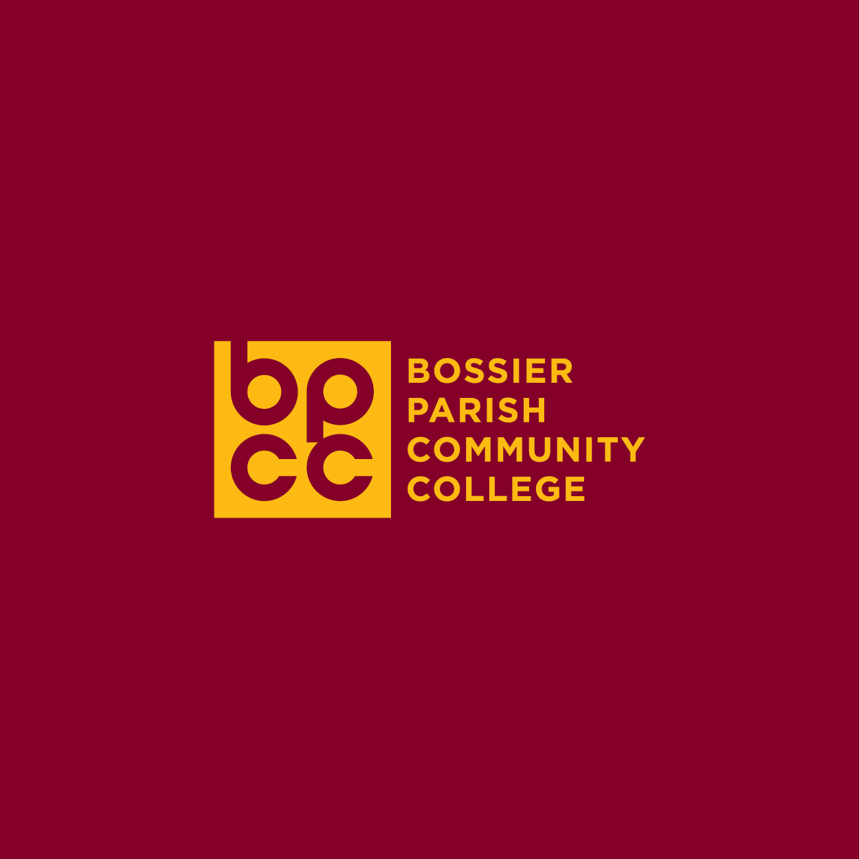
updated logo
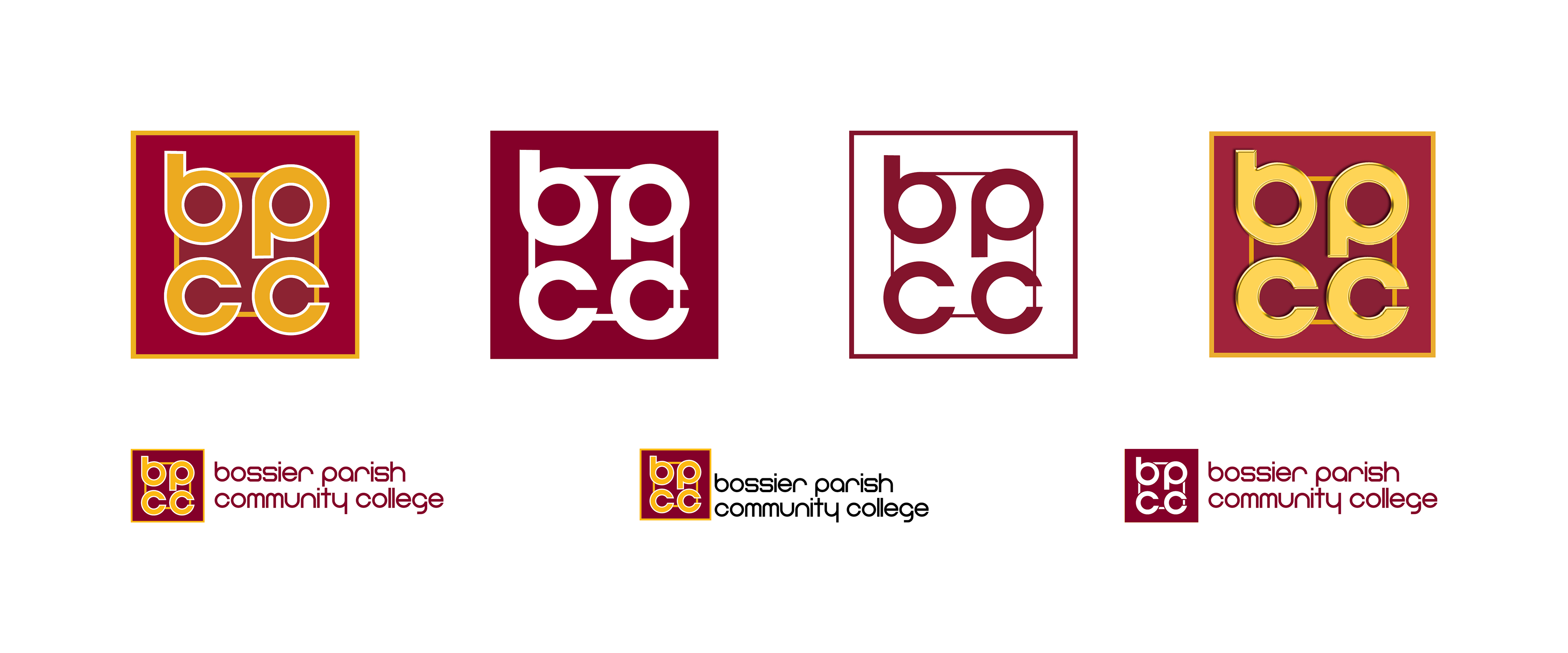
brand inconsistencies identified
design challenges
Fine details became difficult to distinguish when the logo was reduced in size or viewed from a distance.
The inner gold square partially enclosed the second "C," reducing character clarity.
The white outline against the gold shape created a loss of crispness at smaller sizes.
Spacing and alignment inconsistencies weakened the overall geometric structure of the mark.
The logo's visual style reflected older design trends and contained unnecessary complexity.
The Bayer Sans typeface became difficult to read when scaled down or viewed from a distance.
design solutions
Removed non-essential elements to improve clarity and legibility across applications.
Applied a grid-based approach to create consistent spacing, symmetry, and alignment.
Simplified the mark to create a cleaner, more contemporary visual identity.
Replaced Bayer Sans with Gotham Bold to improve readability and visual impact.
Reconfigured the typography into a stacked format, creating a more compact and versatile logo.
Improved scalability and recognition across print, digital, signage, and promotional materials.